top of page


Client: Sup Shack Paddleboards
My Role: Graphic Designer and Creative Lead.
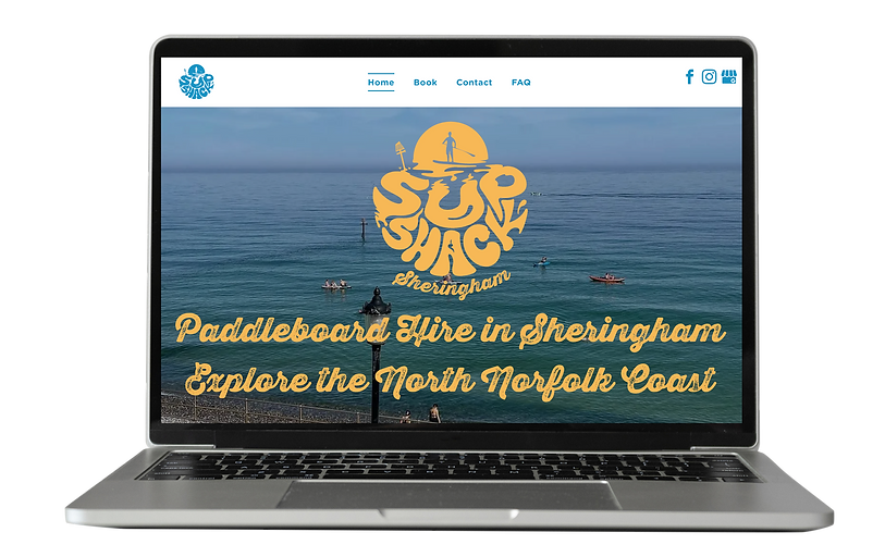
Brief: I recently led a rebrand for SUP Shack Sheringham, refreshing their visual identity while preserving key elements of their original logo to honour the company’s roots. The updated design introduces a more modern, approachable look that’s better suited for merchandise and appeals to a wider audience. This new branding helps position the business for growth by making it more visually engaging and accessible to both locals and visitors.


OLD
NEW


bottom of page